
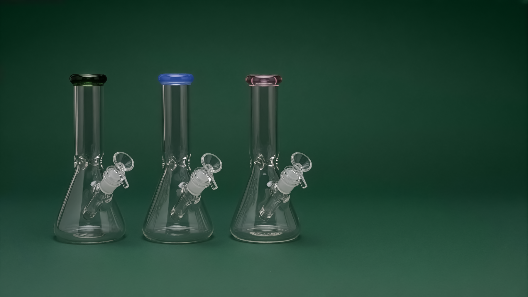
Why this category?
It started with a month I didn't plan for.
I was serving at a Korean BBQ spot when a kitchen fire closed it for about a month. With the time suddenly free, Tim and I decided to finally build something together. We gave ourselves one month to do it, and that deadline shaped a lot of what followed. By the time the restaurant reopened, the brand, the store, the photography, and the launch were done.
We wanted a growing category where design could make a visible difference. Smoking accessories fit: the category is becoming more mainstream and the audience is broadening, but the design language is stuck a decade behind — neon, skulls, and "stoner" signaling everywhere. That gap was the opportunity: a brand with better design and a more considered shopping experience.
The category came with restrictions: advertising bans, processor risk, and legal limits on marketing. Some of that we expected; some we only found out once we were building.
A changing buyer the category hasn't caught up with.
Our bet was that as the category goes mainstream, the buyer changes: design-literate adults, roughly 25–35, who already buy from brands like Aesop, Arc'teryx, and Apple and expect that standard from everything they own. They want the product without the subculture costume, and the shelf they'd put it on is a high one to reach.
How do you make someone proud to leave it out, instead of hiding it in a drawer?
"I'll happily pay more for something that looks like it belongs in my apartment. I just don't want it to look like it came from a gas station."
Goals
- Quality gear that reads as design, not paraphernalia
- A store she can trust with her card and address
- Discreet, no-logo delivery
Frustrations
- The category looks juvenile and loud
- Sketchy storefronts with little useful information
- No way to judge quality before buying
Maya is a composite built from conversations with friends and testers in our target group, and her quote paraphrases things they said. She's the person every decision in the project answers to.
The restrictions drove the design.
This category comes with a lot of restrictions, and each one shaped a specific decision about how the brand looks, reads, and grows.
No paid ads
Meta, Google, and most platforms won't run the category. Organic and owned channels are the only way to grow, so the site and content are the marketing.
Payment-processor risk
Processing is fragile for the category and can be pulled. It had to be set up carefully so orders clear cleanly.
Mandatory 21+ gate
Age verification is required and becomes the first thing a visitor meets, so it had to gate without feeling hostile.
Legal limits on copy
There are rules on what the marketing can claim, especially around health and charitable giving. The wording had to be careful and kept current.
Gallery, not headshop.
The positioning came first and became the filter for everything after it: I'd build something that reads like a design brand and never like a smoke shop. That decision set the color, the type, the photography, and what the copy is allowed to say.

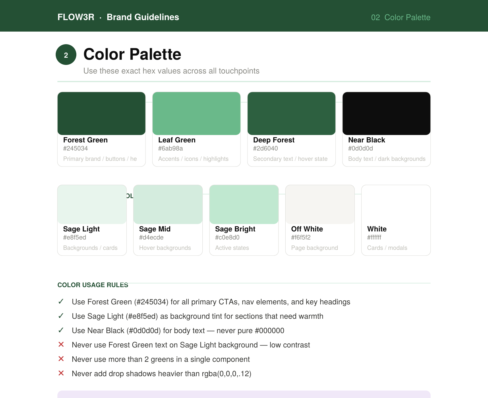
One font, restrained color, a lot of white
Forest green for the dramatic moments, white as the base, near-black text, thin hairlines for rhythm, and a single typeface, PP Neue Montreal, across every weight. Restraint is the point: one font, used well, reads more premium than a mixed stack.
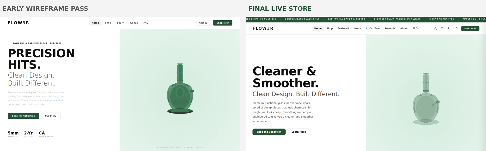
The palette took a couple of tries. I started on a cream base, but next to the product it read soft and a little dated, so I moved the whole site to pure white and let the glass and the green carry it.
One detail I'm glad I made by hand: the mark itself. The flower is four petals wrapped around a cross of negative space. I drew and refined it myself, and it carries through the whole brand, from the favicon to the storefront to the loader on this page.
A voice with rules
The brand voice is confident, minimal, and adult, and I held it to a banned-language list — no slang, no "elevate your experience," no fake-luxury filler — plus a banned-fonts list so the type never drifts. Rules kept the brand consistent across the build while I worked alone on the design side.
A consistency audit
I ran a site-wide pass so the FAQ, the policy pages, and the product copy all state the same shipping windows, return windows, and guarantee terms. Contradictions at checkout quietly erode trust, so I treated factual consistency as a design problem.
The charity-copy call
Flow3r donates a portion of one collection's sales to California cat rescue. California regulates businesses that advertise that purchases benefit a charity, so I avoided quantified cause-marketing claims and a named partner until we could formalize the partnership and confirm which requirements applied. Until then, the wording stayed modest and consistent on every surface.

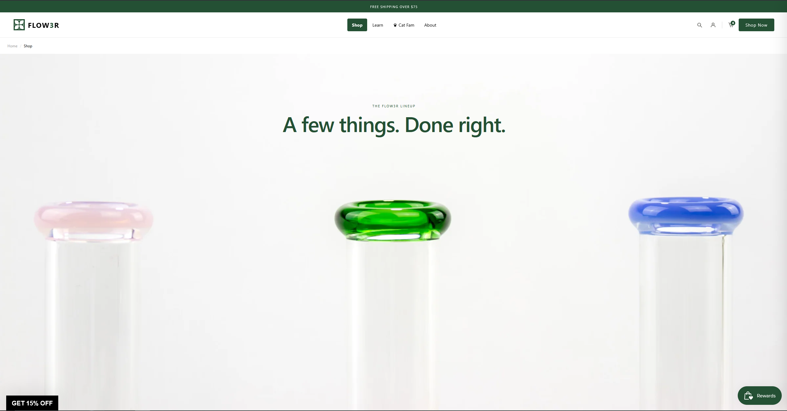
A store that's easy to buy from.
I designed the full experience around one job: get the right person to a confident purchase without friction or doubt. That meant a clear map, a flow that respects the legal gate, a cart focused on order value without being pushy, and testing every step against how testers behaved.
The map
A tight information architecture, with support links wired to jump straight to the right answer instead of dropping people at the top of a long page.
The purchase flow
The 21+ gate is the first interaction, so the flow had to absorb that friction and keep momentum to checkout.
Testing told me what to fix
I put the live site in front of 10+ people across a few rounds — friends and friends-of-friends — and gave them concrete tasks ("buy this water pipe," "find the return policy," "check out on your phone") instead of asking whether they liked it. Where someone hesitated, that became the next thing to change.
Decision log — what testing changed
Removing a cart item waited on the server, so the UI lagged.
People tapped twice and thought it was broken.
Optimistic UI: the item fades out instantly and syncs in the background.
Support links dropped people at the top of a long FAQ.
Testers scrolled, gave up, and asked me directly.
Footer links jump to the exact anchored answer (shipping, returns).
An early theme direction I'd spent a lot of time on.
It read wrong next to the premium references. It looked cheaper, not calmer.
Scrapped it and restarted, including killing the cream palette for pure white.
Brand and policy copy that had drifted page to page.
Terms contradicted each other, which is exactly what kills trust at checkout.
Rewrote the pages and ran a consistency audit so every surface matches.
The cart, in detail
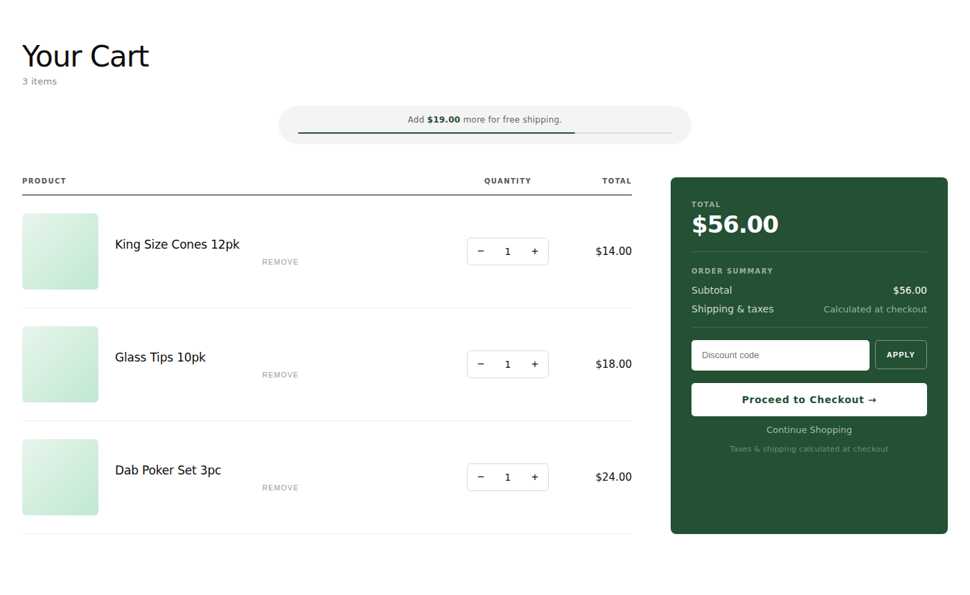
A free-shipping progress bar tied to a clear threshold, an order summary, a discount field, and a "you might also like" module, all aimed at order value without nagging. Edge states are intentional too: consistent "Cart" labeling everywhere, a deliberate grid per breakpoint (two-up on mobile, three-up on desktop), and sold-out states that read as designed rather than broken.
Release gate
Before driving any traffic, I treated a full order on an actual phone — homepage to confirmation email — as a hard gate. If someone couldn't buy and trust the confirmation, nothing else mattered yet.
From a design file to a working business.
To charge premium prices, the product, the photos, and the store all had to hold up: vetted suppliers, my own photography, a custom build, and a launch in a category that doesn't allow shortcuts.
Sourcing the product
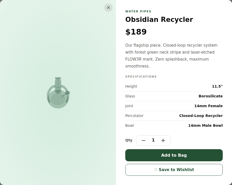
I contacted and vetted a range of suppliers, including overseas ones, took meetings, and negotiated to find product that could carry a premium price: lab-grade borosilicate, specs chosen for how the piece performs, and a base wide enough to be stable and easy to clean.
Engineered airflow
Downstem, chamber, and joint chosen for a clean, smooth draw.
Borosilicate only
Lab-grade glass, chemically inert at any temperature.
Clean is a feature
Wide bases and removable parts; gear that isn't a chore.
Shooting it myself
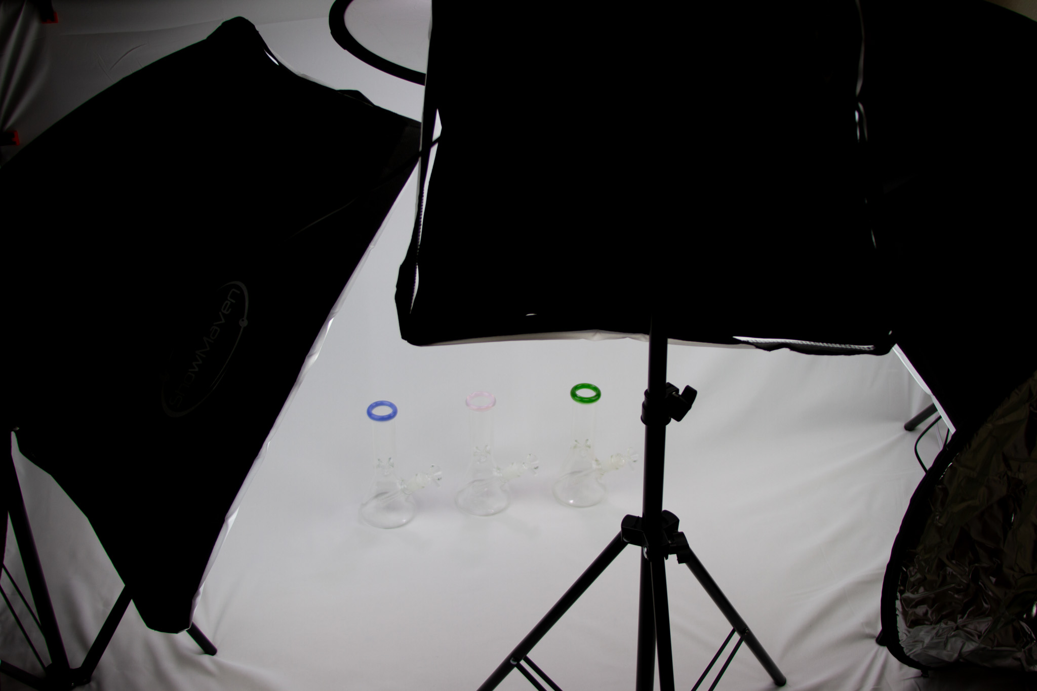
On a small budget, I shot the product at home with a DIY setup in my room with controlled lighting, reflectors, and a clean backdrop, using my camera from a photography class. Glass is hard to light, so the work was in the patience and the setup. I finished everything in Photoshop (retouching, spot cleanup) and Lightroom Classic (consistent color across the catalog), then compressed and pushed each asset to the CDN so the site stays fast.

Building the storefront
The storefront is a custom Shopify Liquid theme I built with Claude Code. Every brand, UX, and product decision was mine. I specified the design and behavior, then tested and debugged each change against the live store.
Launching it
Flow3r launched and took its first orders, mostly through word of mouth. Growth had to be organic, so the store and content were the engine, with social feeding it (an early post landed around 200 likes). I held back launch discounts to protect the premium read, and wound the store down after the first operating cycle, when our funding ran out.
Discreet shipping
Plain box. No logos.
1-year guarantee
Manufacturing defects covered.
14-day returns
Unused, unopened.
CA fulfillment
1–3 business days.
Debugging a live store
Working on a published store, I learned to pull the actual theme files through Shopify's API before judging anything, because the public HTML is cached and can show a stale, false picture. That habit stopped several false bug reports. I traced a cart bug where a product-title field came back empty and shipped a small JavaScript fallback to refill it, and I kept the cart drawer and cart page on separate class names so styles couldn't leak between them.
When the ads got denied
Paid ads got rejected for the category, as expected. Instead of fighting the policy, I leaned the whole growth plan into organic and owned channels (content, SEO, and social) so the business doesn't depend on a door that's closed.
Keeping it legal and current
Because this was an operating business in a regulated space, the policy and claims work carried real legal risk, not just copy. Rules and platform policies change, so I treated the legal-adjacent pages as living documents and kept them accurate and up to date as things moved.

What I'd do differently, and what it proved.
On a deadline that tight, restarting is expensive, so I didn't do it on a whim. Each time was a deliberate call: keep what was working and improve it, or change direction when a better idea or a failed test made the case. I rewrote the theme, the palette, and whole pages that way, and the project got better each time.
It also showed we could take a brand from an idea to a launched, working store on a deadline we set for ourselves.
What I took away
How much of good design in a business is restraint and correctness — consistent copy, fast images, honest claims, careful legal wording — not only how it looks. And that testing beats taste when the two disagree.
What I'd improve next time
Put rough flows in front of target buyers earlier, write the brand and content rules down before the first screen instead of auditing them into shape later, and set up clean analytics from day one so I'm measuring the funnel from the first visit.
What it took: brand strategy and identity, UX and information architecture, usability testing, conversion-focused e-commerce UX, compliance-aware copy, sourcing, photography, and a custom Shopify build — held together by a willingness to test and restart until it was right.